
last correction for those ones, i repaint some of the details, change a thing or two, and add a smart sharpen to lessen the overall blur.
i did a little before/after to analyse what's good and bad.
i 'll start on nature landscape, as you did, right now.
----------------------------------------------------------------------------------------------------------------------------

second batch for this one, those were good advice you gave me !
----------------------------------------------------------------------------------------------------------------------------
those are meant to be viewed very small ( half size).
first one, about 30-60 min, too much black and messy i think. contrast a bit strong i think.

second one : 40 min : softer and distance ( fog ) is better i think but i am having a hard time to design and paint at the same time .

(edit)
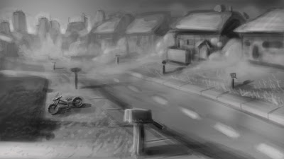
there is a third one : 30-40 min : i loved the movie " the mist " ; whaat i didn't love was painting fog and houses :
----------------------------------------------------------------------------------------------------------------------------
J: I especially love the first and second one, I think you make great use of light and environment in those. The third one, seems to have a very interesting story (fallen over bicycle, low sun, something at the end of the street..) but it doesn't read as clear as the other two to me because
1. Composition .. if you look at it far away there are no big shapes, movements and color separation (mostly a uniform grey)
2. (This is also evident in your other two drawings but a little more pronounced in the third one) thick 'foggy' lines where it looks like you painted over it at least a few times (ex the line across the houses delineating the roof) One confident dark stroke would help get rid of the 'rounded' feeling and help it seem sharper and more professional, confident. Well, this is all just my own opinion, hopefully I helped a little. ^_^
----------------------------------------------------------------------------------------------------------------------------
yeah i think you are right. i use opacity on the brush too much, so i need to do 4-5 brush strokes to make a visible line. i correct the roof as an exemple just to check this out.
i tried to re evaluate my composition i think it lacked a point of interest.
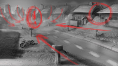
here is a new try , just to see how it works.


------------------------------------------------------------

There are, just a few small things I see that's weakening the composition.
1. The road leads out and below, making the viewer's eye slide down out of the page
2. The mailbox is almost right in the middle of the paper almost as if it's a secondary focus point.
3. The relative darkness of the mecha ship object stands out a little too much, it'd be nice if there were other areas of darkness to balance it out.
4. Bottom left corner leads eye out, too.
Great things that you did, though: left and right top corners are great, they block the eye from escaping and the faraway buildings are especially nice in leading back to the robot, great atmospheric change too.
Just one more thing, this can be good or bad, but the house on the way right, looks like a face! D:
Aucun commentaire:
Enregistrer un commentaire