Affichage des articles dont le libellé est RogerRoger. Afficher tous les articles

lundi 8 août 2011

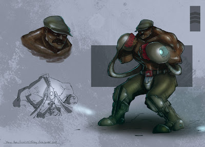
RR // Character creation Male Human


Whooooo time flies !

here is the first character i did for the bulky looking kind of guy.
i tried a new style, as told in fengzhu's tutorials about character sketching.

more to come ...

-
Wow nice!! I saw these in your blog yesterday but couldn't comment b/c no laptop. I've been away for college orientation a few days. Thanks for referring to FZ's advice about trying diff styles, now that I think about it I've been staying in one sort of style too long xD The only crit I have about these are what Matt Kohr calls "surface identification" I've noticed most of your materials seem same in terms of texture, glossiness, etc, I think it would add a lot if different textures were represented. Otherwise I love it, I like the overall design anatomy and feel, etc :)
--------------------------------------------------------------------------------------------


ok i just "finished", i did not clean it up because i just wanted to put down some general shape and see how i can manage to alterate the body of t0hat guy.
the two extremes ( right and left) are like zombie and hulk kind of guys.

i need to work on feet, hands, maybe knees, and shoulder i think. as well as a general anatomy re- work might do me well.

i think i will work on two exercice after that :

- anatomy
- character design male character/ with the different shape.

to you want to themed the exercice or not ?

i've been working on my portfolio website these days so this is why i had a little less time for drawing.
i'm moving to montréal/canada in a month so i need my portfolio to be up and running by that time.
So i will need to work harder once it is done.
i need to fill it with up to date/skills works.
i think i will reworked the two character i did and post them here for you to see in a few days.

and also i'll will be on holiday from next thursday to monday without access to the internet so don't worry if i don't post anything.

I'll expecting a lot of drawings from you to see on monday, so don't be lazy ;)
-
lol! I'll be sure to draw lots of characters :P Good luck with your portfolio and the moving!
As for your character update, anatomy is probably your only concern. One other issue is that sometimes you emphasize the wrong muscles (for example in the dilapated skeleton-zombie-skinny dude, he would show some muscle just because of the lack of fat, but they would hardly be bulging and muscular. Also in the second-to last dude, his upper thigh muscles are quite thick giving him a feminine look, I think in exaggerations like these it's better to emphasize the 'manly' muscles such as shoulders and arms. In the last guy it's okay because he has large upper muscles too. Just a thought! ^_^

------------------------------------------------------------------------------------------------

just a quick wip, so you can see what i'm working on, different human male shape just skinny to bulky right now but i don't have much time these days.
i'll finish it and then start some character creation base on those different shape.


-

Wow great looking so far :) Great exercise idea too. Can't wait to see an update. Take your time if you are busy of course, I've been busy this week too (or excuse for slacking? idk xD)

vendredi 29 juillet 2011

Environment - Landscape Prep [ edit J]


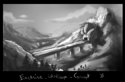
one last quick speed on the mountain landscape.


-----------------------------------------------------------------------------------------------------------------------------------


Thanks for the brush tip ! i tried it, that's kind of cool for hard geometrical and angular shape/texture.
-----------------------------------------------------------------------------------------------------------


R : i tried to find a less rounded brush but it wasn't really good, Can you give a screenshots of what kind of brush you use for rock and all ?

i worked 1-2h more on that picture, have some mixed feelings about it.
but glad that i took the time to really work the composition and values and did not rushed into making details and stuff.
-
Sure thing, here are the 2 brushes I use the most (the diamond brush I use for literally everything, the rectangle more for rocks and buildings and stuff) You can also add default PS texture for a more rocky brush

I really like where you went with this piece ^_^ I guess, the only criticism I have is the rock-hill at bottom left, it looks very flat. Maybe if you made the white highlight rim sharper and thinner? Unless it is supposed to be a wall - then I suppose it's fine. Everything else, values composition and texture, I like :)

-------------------------------------------------------------------------------------------------------------------


Ok, did the same as you, 10 min, 1 and 2 are from photo ref
3 and 4 imagination only.
this is a good exercice for values and quick painting.

i'm adding one image ( as part of the exercice, around 20 min, as an quick application of what we are working on.


-
J: These are nice! Just one suggestion that I read lately - for rocks and hard/sharp objects (like the mountains, or the bridge) try using harder, angled brushes, it can give a sense of crisp edges. Just something to try out if you have time. ^_^


jeudi 28 juillet 2011

Arm anatomy and posing __ Exercice 02


some crapy speed skectches from photo, not really satisfied as you can see ;)

Nice! I think these are a great start. Some parts look awkward/flat but I'm sure you already know that, but really otherwise it's looking good. Can't wait to see some more xD


----------------------------------------------------------------------------------

really quick posing about a few minutes each .
i think i'll work on the hand because i'm not good at it right now.


--
J: These are looking great! The only thing I might suggest, is to use a harder darker brush and try making sweeping lines for confidence. Something that I was told, recently, and it worked for me in getting things to look right faster and more efficiently (with less line) Personal preference, but it might be worth it to give it a try. (Of course erase this later if you want to ^_^)

First thumbnail (edit) __ Exercice 01 [correction pt 3]


last correction for those ones, i repaint some of the details, change a thing or two, and add a smart sharpen to lessen the overall blur.
i did a little before/after to analyse what's good and bad.
i 'll start on nature landscape, as you did, right now.


----------------------------------------------------------------------------------------------------------------------------


second batch for this one, those were good advice you gave me !


----------------------------------------------------------------------------------------------------------------------------


i'll be starting with two rough i did this morning :

those are meant to be viewed very small ( half size).

first one, about 30-60 min, too much black and messy i think. contrast a bit strong i think.


second one : 40 min : softer and distance ( fog ) is better i think but i am having a hard time to design and paint at the same time .


(edit)

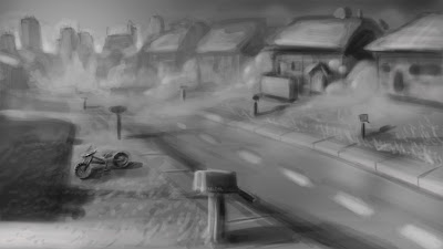
there is a third one : 30-40 min : i loved the movie " the mist " ; whaat i didn't love was painting fog and houses :


----------------------------------------------------------------------------------------------------------------------------
J: I especially love the first and second one, I think you make great use of light and environment in those. The third one, seems to have a very interesting story (fallen over bicycle, low sun, something at the end of the street..) but it doesn't read as clear as the other two to me because
1. Composition .. if you look at it far away there are no big shapes, movements and color separation (mostly a uniform grey)
2. (This is also evident in your other two drawings but a little more pronounced in the third one) thick 'foggy' lines where it looks like you painted over it at least a few times (ex the line across the houses delineating the roof) One confident dark stroke would help get rid of the 'rounded' feeling and help it seem sharper and more professional, confident. Well, this is all just my own opinion, hopefully I helped a little. ^_^


----------------------------------------------------------------------------------------------------------------------------

yeah i think you are right. i use opacity on the brush too much, so i need to do 4-5 brush strokes to make a visible line. i correct the roof as an exemple just to check this out.

i tried to re evaluate my composition i think it lacked a point of interest.


here is a new try , just to see how it works.


------------------------------------------------------------
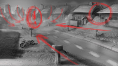
There are, just a few small things I see that's weakening the composition.
1. The road leads out and below, making the viewer's eye slide down out of the page
2. The mailbox is almost right in the middle of the paper almost as if it's a secondary focus point.
3. The relative darkness of the mecha ship object stands out a little too much, it'd be nice if there were other areas of darkness to balance it out.
4. Bottom left corner leads eye out, too.
Great things that you did, though: left and right top corners are great, they block the eye from escaping and the faraway buildings are especially nice in leading back to the robot, great atmospheric change too.
Just one more thing, this can be good or bad, but the house on the way right, looks like a face! D: